Is 'Fight the Fire' Too Hard? Turning Flurry Event Parameter Logs Into Insights
21 May 2015
Eric Fram
All of the code used here is available on GitHub in this repo. I’ve also included some sample data for you to work with, located in the following .csv files:
- SampleApp-startRound-eventParameterValues.csv
- SampleApp-gameEndPopup_WON-eventParameterValues.csv
These files are formatted exactly as they arrive from Flurry. The data contained in these files is not our actual data (I generated it specifically for this purpose), but the distributions are nearly the same as in our actual data. </em>
##Introduction##
This document accompanies the post titled “Fight the Fire v3.0 is Coming! Here’s What to Expect” that was originally posted on ZippyBrain.com on May 20th, 2015. Link to the Article. The code included here will show you how I used Flurry event parameter data to find out which levels in Fight the Fire are just too hard.
Fight the Fire has custom Flurry events that log when users start a level and that log when users complete a level. Each of these events also has a parameter, which logs which level these events relate to. This data is all anonymous, and we don’t have any way to track it to a specific device.
The event in Fight the Fire that logs how many times people play a level is called “startRound”, and the event that logs how many times people complete a level is called “gameEndPopup_WON”. Both of these events are logged with a parameter value from 1 to 50, which indicates the level the event is associated with.
Flurry makes it super easy to access all of your apps’ event parameter data, but you have to know where to look. To get to it, follow these steps:
- Log into Flurry and go to the Applications tab
- Select the application you want to examine
- Open the Events tab on the left menu
- Search for the event your interested in using the Search Event Name box
- On the screen for that event, select Event Parameters from the top menu
- Scroll down to Detailed View and then click Download CSV
In this case, since I’m interested in comparing different events with the same parameters, I repeat steps 2 to 6 to get data for startRound and then get data for gameEndPopup_WON.
Once I have all this data, I can use R to merge it together and plot it. Doing this makes it really easy to see which levels are causing the most trouble.
Before we get started, I’m going to tell R where the events logs are located and what they’re called.
directory <- getwd()
file <- 'SampleApp-startRound-eventParameterValues.csv'
file2 <- 'SampleApp-gameEndPopup_WON-eventParameterValues.csv'
##Step 1: Which Levels Get Played The Most?##
For now, let’s just see how many times each level has been attempted. I’m just going to look at startRound event data. This code will read the unmodified Flurry event parameter CSV.
#get the attempts data and order it by parameter
get.Attempts.Data <- function(directory,file) {

      #read the csv
      df <- read.csv(paste(directory,'/',file,sep=''), header=FALSE, skip=1)
      colnames(df) <- c('Level','Attempts','PercentofObs')

      #take only Level and Count columns, order by Level
      require(sqldf)
      df <- sqldf("
                  SELECT Level, Attempts
                  FROM df
                  ORDER BY Level ASC
                  ")
}

#execute the function
ftf.Attempts <- get.Attempts.Data(directory,file)
head(ftf.Attempts)
##   Level Attempts
## 1     1   340380
## 2     2   259858
## 3     3   344641
## 4     4   253692
## 5     5   335904
## 6     6   299026
Now let’s see which levels get played the most (I’m not worried about making the graph super attractive yet):
#plot the data as histogram
plot.Attempts <- function(df=ftf.Attempts) {
      require(ggplot2)
      plot <- ggplot(df, aes(x=Level,y=Attempts)) + geom_bar(stat='identity')
      plot
}

Attempts.plot <- plot.Attempts(df=ftf.Attempts)
Attempts.plot
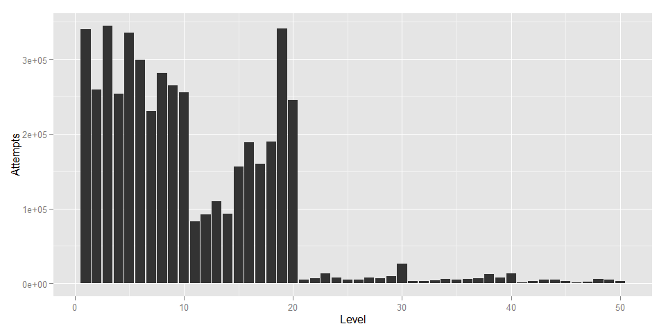
Levels 1 to 20 are free to play, which explains why those levels have been attempted so many more times than 21+.
##Step 2: Which Levels Get Finished the Most?##
Now that we know how many times each level has been attempted, I’ll read in the gameEndPopup_WON event data to see how many times each level has been won.
#get the success data and order it by parameter
get.Success.Data <- function(directory,file2) {

      #read the csv
      df <- read.csv(paste(directory,'/',file2,sep=''), header=FALSE, skip=1)
      colnames(df) <- c('Level','Success','PercentofObs')

      #take only Level and Count columns, order by Level
      require(sqldf)
      df <- sqldf("
                  SELECT Level, Success
                  FROM df
                  ORDER BY Level ASC
                  ")
}

ftf.Success <- get.Success.Data(directory,file2)

#plot the data as histogram
plot.Success <- function(df=ftf.Success) {
      require(ggplot2)
      plot <- ggplot(df, aes(x=Level,y=Success)) + geom_bar(stat='identity')
      plot
}

Success.plot <- plot.Success(ftf.Success)
Success.plot
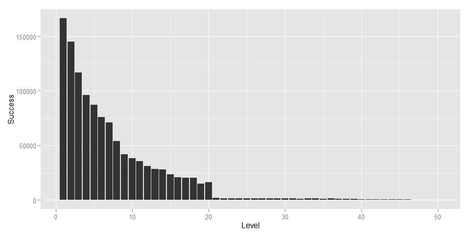 This data looks like it follows an inverse exponential distribution pretty closely. I was surprised to see that the gameEndPopup_WON events followed a distribution like this, while the startRound events did not.
##Put It Together##
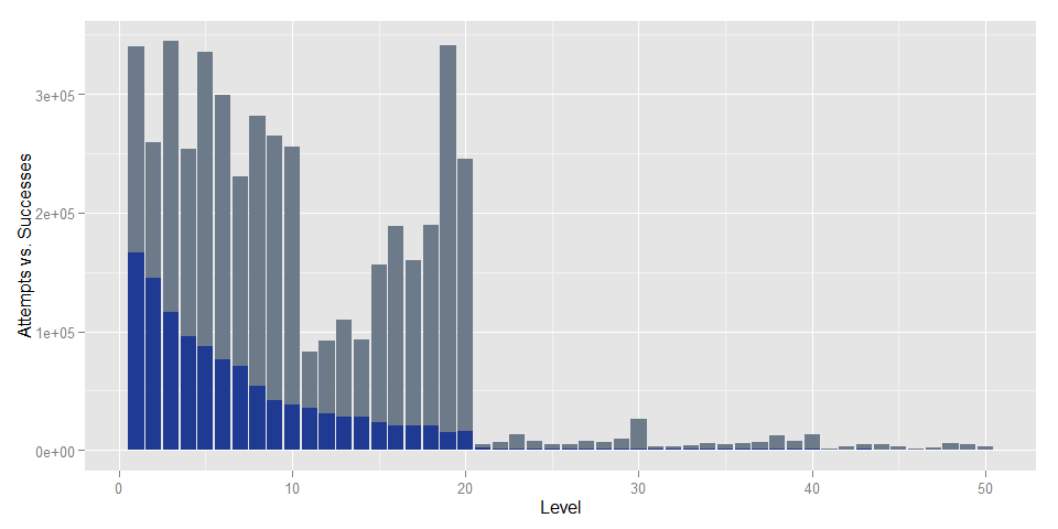
To make it easier to compare attempts vs. successes for each level, lets put the data together.
#combine attempts and success data
data.Merge <- function(df1=ftf.Attempts, df2=ftf.Success) {
      data.merged <- merge(df1,df2,by='Level')
}

ftf.Merged <- data.Merge(ftf.Attempts,ftf.Success)
Now that the data is all in one data frame, we can plot the comparison:
#plot overlaid bars
plot.Merged <- function(df=ftf.Merged) {
      require(ggplot2)
      plot <- ggplot(data=df, aes(x=Level,y=Attempts)) + geom_bar(stat='identity', fill="#6C7A89")
      plot <- plot + geom_bar(data=df, aes(x=Level,y=Success), stat='identity',fill='#1F3A93')
      plot <- plot + ylab("Attempts vs. Successes")
      plot
}

Merged.plot <- plot.Merged(ftf.Merged)
Merged.plot
#Drill Down##
The last plot helps us look at the overall trends, but let’s drill down a little bit deeper to see where players are running into problems. First, I’ll find out what the success rate is for each level by dividing the total sucessful attempts by total attempts for each level.
#find out percent of successful attempts
percent.Success <- function(df=ftf.Merged) {
      df$SuccessRatio <- df$Success/df$Attempts
      df
}
ftf.Merged <- percent.Success(ftf.Merged)
Now I’ll plot this new information.
#plot success ratio
plot.Ratio <- function(df=ftf.Merged){
      require(ggplot2)
      plot <- ggplot(data=df, aes(x=Level,y=SuccessRatio)) + geom_bar(stat='identity',fill="#1F3A93")
      plot <- plot + geom_text(aes(label=format(round(SuccessRatio,2),nsmall=2)),size=3,hjust=0,vjust=.4,angle=90)
      plot <- plot + scale_y_continuous(limits=c(0,.6))
      plot <- plot + scale_x_continuous(breaks=1:50)
      plot
}

Ratio.plot <- plot.Ratio(ftf.Merged)
Ratio.plot
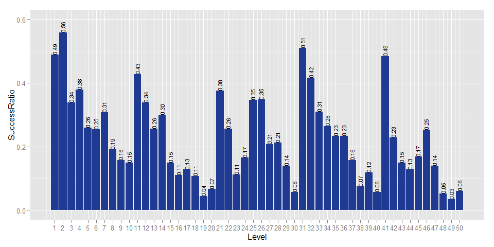
Now we can start to see a meaningful pattern. Within each biome (each of which is 10 levels), the first few levels are easy, but they get progressively harder towards the end. We designed the difficulty progression to challenge players a lot towards the end of each biome (so, levels 8-10, 17-20, 27-30, etc). Clearly though, especially in the first two biomes, we made that progression too step. We really want players to experience levels 21-50. If players are getting stuck on level 19 with a 4% pass rate, that’s something we need to change, hence the upcoming update.
I hope you found this useful! If you are working with Flurry data for a game with lots of levels, you may find these techniques useful for your own purposes. Please tweet any questions or comments to @ZippyBrain.